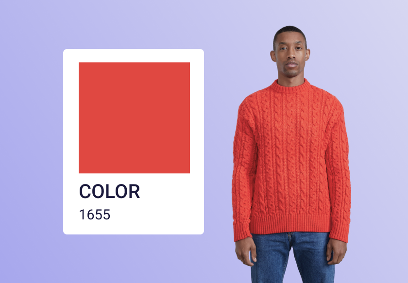
Color Variations
The Challenge: Creating and managing colorways for each new garment is a time-intensive, complicated part of the retouching process and, as a result, can often deal with issues of consistency or accuracy.The Solution: AI-generated PSD files built through multi-step image analysis, delivering high-quality, consistent colorways that capture the true essence of both the garment and color every time.
Colors are a funny thing. The fact that they are basically reflections and absorption of lightwaves makes them deceptively simple to grasp and endlessly complicated to understand. One thing is for sure, though, in e-commerce, we use a lot of colors. There are color variations of products, and there is the importance of colors actually being right and consistent.
Both are issues we’re building tools to help with. But let’s start with a breakdown of how we are doing things differently than just selecting a hue and rotating it… We have actually ended up splitting the process into 7 steps (well, 8 if you count the option to process multiple images). To illustrate, let's take the example of a piece of clothing.

Identification
First of all, we need to find out what piece of garment we need to work with. We do this by either grabbing the one piece of garment in the picture, or if there are multiple, we look into the product database and find what kind of garment it is, and use AI to select.
Segmentation
Now we know what we’ll be working with. It’s time to do the proper masking or segmentation. We use a mix of different methods here, including training our own models to make sure we get the intricate details, hairs, defocused areas, and so on. This, again, is one of the places where working in a niche comes as a huge advantage.
Sub-segmentation
It’s all great until we then run into logos, labels, zippers, buttons, etc. We segment these out as well and subtract from the main segmentation. Now we’re (almost) ready.
Extract highlights and shadows
Because of physics, and optics, as well as everything we see being in a gamma 2.2’ish colorspace, we have found that we need to extract the highlights and shadows from the garments. Both of these “extremes” tend to lose saturation. Shadows because they lack the light to transmit the full saturation and highlights because the reflection of the light source color will often overtake the actual surface color. So we take those away.
Adaptively rotate the hue and saturation
We constantly analyse surfaces and their reactions to light. Not only do the shadows and highlights change the color, but so does the angle of incidence (the fresnel effect), which depending on the material, will brighten and desaturate the colors as well. So we are building out a model of color change look-up-tables to accurately account for this.


Color science and analysis of fabric surfaces
Putting it all back together…
We’re now ready to put it all back together into a full fidelity, high-quality image…. simple… And because we are aware that there will always be special cases that require some extra finesse on some images, we’ll make sure to supply you with a layered PSD file ready for finetuning.


And doing it again…
At Creative Force, we always evaluate things on how they work at scale… so of course, we can apply the same segmentation and color changes to all the images of the same product in one go. No need to repeat the process.
